UniManagement Development NavCenter |
a a w a l k c t h r o u g h c o f c t h e c d e s i g n |
| I started serious development of the NavCenter portion of Unicredit Development in early February, 2006, with a two week stay in Milan. This period involved many meetings with Unicredit Real Estate, Permasteelisa and UniCredit executives as well as trips to the Turin site and the existing Training Center at Villa Gernetto. All of these experiences impacted my thinking about both the requirements and the opportunities of this new facility. The history of UniCredit, its strategy to be come a true European bank, the environment which this facility will be replacing and the context of Turin itself, all sum up to an unique challenge which this facility must meet - and meet gracefully. |
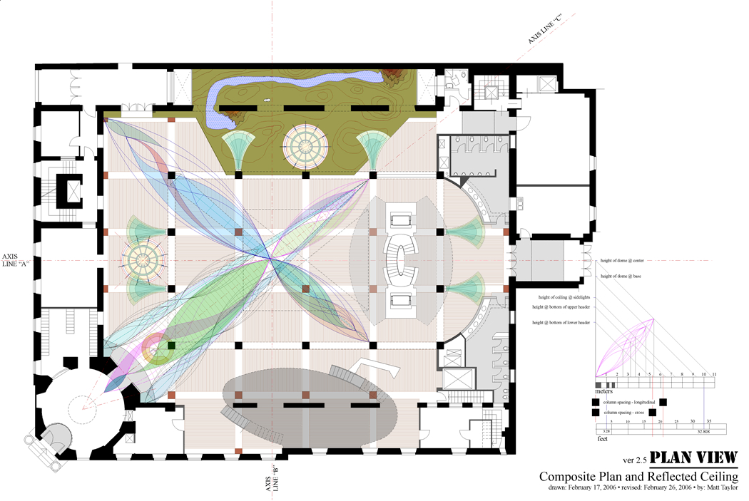
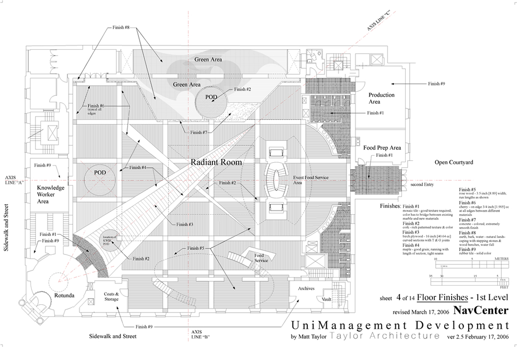
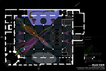
| My thoughts on these matters are covered in the Program Statement and the Specifications sections of this site. Below, I walk through the Floor Plan. Elevations and Sections are provided elsewhere. The plan is the heart of any environment. It is here where all the key relationships are established. In the case of this drawing, the floor levels, finishes and Armature are all superimposed over each other. This way, the entire fabric of the space can be discerned. |
|
| It is a Taylor design Axiom that “everything speaks.” In this environment, we create a world - a connected world to be sure - yet, a world of the mind, body and soul - free of the world of transactions - to focus on learning and collaborative work. Work augmented by an environment of shelter, process, technology, symbol and art. UniCredit Development will be an example of a viable workplace where the human capital of UniCredit can learn and design their path to a sustainable future. |
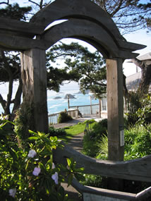
| I took this picture at the Villa which has been a part of UniCredit’s history since 1976. It struck me that one tradition was giving way to another. What is the appropriate house for this to take place? |
|
the story starts at the beginning... |
|
 |
ENTRY
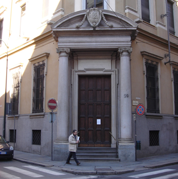
The main Entry [link: pattern langage - entry requires registration 20 USD a month, well worth it] is on a narrow street corner. There are several hotels within walking distance. The core of Turin is a walk-able city with both some medieval and mostly baroque pattern language. This Entry will be the main one for the entire facility which is on different levels and can involve travel in excess of a hundred meters. The Entry is the transition point from the street, from the concerns of the world into a learning, design and collaboration environment. At this point security and logistics have to be handled with care and transparency all the while facilitating a critical transition.
This picture was taken on a clear day in early February a little before noon so the quality of the light can be seen. Some will walk to the UniManagement Development Center, others will arrive by cab or private bus. The logistics of the street are such that only a few vehicles can actually directly approach the Entry at one time. People, therefore, are likely to arrive in packets. The doors from the street are traditional and formal. The Rotunda, directly inside, is exactly what you would expect to see. It is a very nice space and it is here that the first hint of the unexpected will be found.
The Rotunda is being developed by an artist. At this point [February 27, 2006], I have not seen his design. I assume that he is going to play with it and mix historical and modern idioms. Other than restore it this is about all that can happen. The Rotunda is a punctuation point between the street scene and the NavCenter. The NavCenter is only a small portion of the entire project however is it is the main point of access. This presents several design challenges that have to be met: The Academy is a retreat environment - not isolated - but away. Within 45 feet (about 13 and a half meters) the outside world must be gone and those inside have to be in a world crafted to be perfect for whatever they are doing. Someone coming into the space must be invited in and feel invited. At the same time the activities taking place in the great room - which is open - have to be protected. Those working there cannot feel exposed and those coming into the environment cannot feel crowded or like they are intruders. The logistics as well as the architecture has to send the right message.
It also should be remembered that through these doors is also the way people leave the environment. Coming in and going transitions are not the same. Further, there are several different modalities that have to be addressed: day-to-day, non event; a large event for internal UniCredit people; large event for external participants or mixed with UniCredit; several activities of various kinds. Visitors going to other parts of UniManagement Development will have to come through the NavCenter, travel to and go up an elevator, then around a horse shoe path to their destination. They will require guidance: people support, signs, maps and a building which has center, direction, focus and sense of place. These design issues should be carefully considered in the deign of the rest of the interior space - hallways are best thought of as streets - the superb pattern language of the outside should be reflected in the experience of traveling the interior landscape [link: streets for people].
|
|
 |
The ENTRY EXPERIENCE is...
An interface issue, a transition, a change in consciousness. The Villa at Lesmo is full of examples of the awareness that was once brought to this experience. Modern architecture tends to open a door and there you are. After a brief lobby - a look at what ever “architecture” there is - you are then thrust into elevators ands hallways with no variety, destination or midpoint. The body gets there but the mind remains elsewhere. This is called efficient.
The best way to think about the experience of entry is understand why a play or musical has an overture. Street mode have to be transitioned before the viewer is ready to accept the world of art being presented on the stage. If this transition is not made, the reality of the play is lost and the ability to transform along with it. Architecture is like the background music of your life as you both design it and live it out [link: the art of architecture]. Architecture is built philosophy - it tells you what you and society truly value. As people come in to this space, they will be shown how they are thought to be and what is expected of them. A building’s entry is an overture - the only choice is if it is written as by a Beethoven or Mickey Mouse.
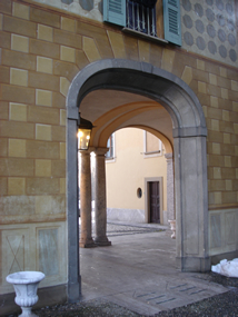
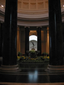
The two pictures are examples of entry, diagonal view, prospect and refuge at Lesmo.
A good street has prospect and refuge, foreground, middle ground and background, periodic “centers,” twists and turns. It has variety held together by armature [link: the path which binds]. It is a series of experiences with alternative branches the traveler can choose - it expresses quest [link: quest]. In the Case of a NavCenter, as we shall see, it is possible for the “traveler” to reorder the path and its artifacts. The NavCenter is composed of mostly moving components. This floor plan, which we study here, is a layout of the built architecture - old and new, which has to work in harmony with each other. The “fixed” elements, with the new architecture, can adjust and change character as required by activities - we will study this also.
Flexible as the this space will be, it is the fixed elements which hold it together, create place, hold the energy of a wide variety of activities and delivers a set of coherent messages to those who use it. These create a main center of the space and a series of subordinate centers, each with their own identity and nature, all forming a whole. |
|
|
|
|
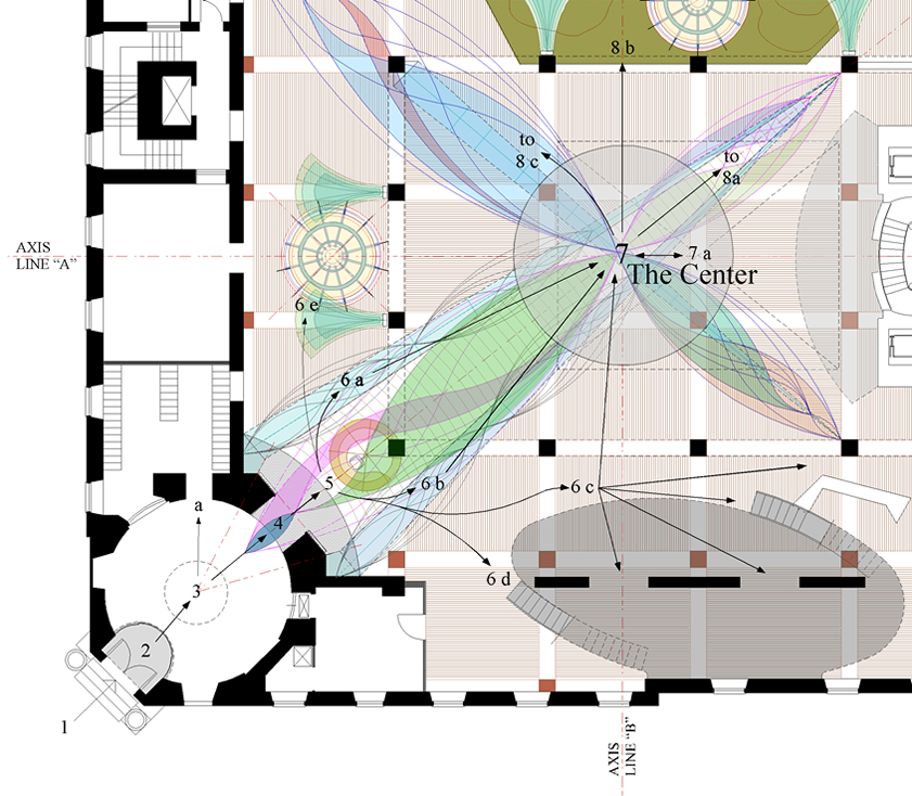
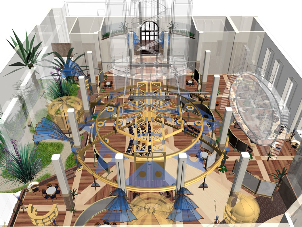
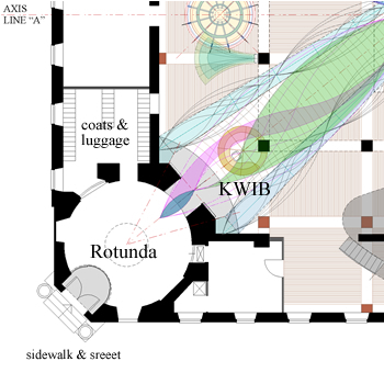
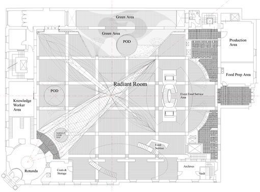
The journey starts on the street [1] looking at the tall wooden doors which can be swung open in greeting. Inside [2], is an all glass (top and sliding doors) Vestibule with electronic security keyed to participant badge or letter of invitation. A transparent camera allows the KWIB [5] to confirm identity( actual person to stored picture). This way the security function is accomplished seamlessly and quickly for the great majority requiring checking of credential for only a few and then only once. Both the Vestibule glass doors [2] and the reconfigured sliding wood inner entry doors [4] are controlled by the KWIB [5].
From the Vestibule it is a few steps to the center [3] of the Rotunda which is on the main diagonal axis of the great room. It is here that the introduction to what is beyond the Rotunda is hinted at by the tip of the Armature at the opening [4] which terminates 105 feet (32 meters) diagonally across the great room.
|
|
From the center of the Rotunda, one can proceed to enter the main space or deposit coats and bags. The Rotunda can provide a number of set up for the greeting function, including handouts and materials display. After these basics, the participant proceeds to the second threshold [4].
The second threshold [4] is at the meeting of the Rotunda and the the main room. At this point, the diagonal axis is firmly established. The existing wood doors are reshaped and mounted on a sliding track - they can remain open most of the time. This provides three doors which can be open or shut, in various combinations, and controlled for esthetic, sound and light insulation and security reasons.
At the threshold between the Rotunda and the the main room, a ramp bring you up to the new built up level (32cc). The radius of the ramp is from the center of the Rotunda. Stepping from the threshold - which is narrowed by the door width - the space opens vertically and horizontally now defined by the Armature buttresses on both sides. The Armature goes around and over the KWIB and leads the eye and awareness to the great room beyond while directing you to the KWIB. It is her that detailed information about the days activities and where to go and how to get there can be gained. Experiences users will move to the right or left as desired. |
|
After the KWIB [5], the path branches [6 a b c d]. How it is traveled with be determined by individual purpose and preference. The entry into the great room is indirect and this is deliberate. The KWIB is a strong focal point from the Rotunda and threshold which “gives way” to the space beyound which starts in ambiquity and ends in clairity. The Armature provides two strong, direct paths [6 a b] - after going around the KWIB - to the NavCenter Center [7] while 6 c d leads to an indirect course with several options. Those going to the elevators and upstairs to the many UniManagement Development Center facilities will proceed along the hallway defined by the columns and lower ceiling and the raised room on the right [6c]. This point also introduces an axis [“B”] which crosses the Center [7] and proceeds to the Garden area at the far side.
From the Center, the entire compostion of the NavCenter can be perceived. This is surrounded by other centers all of a different function, nature and feel. The Armature holds the composition togehter while allowing the eye to “wander” to the perfierary areas creating a sense of endless prospect.
Each of the (subordinate) centers reference back to the Center and each has a specific function as well as the ability to be part of the one integrated collaborative space. These will be described below. First, the function of the Armature has to be explained. |
|
 |
ARMATURE
The concept of Armature was developed by architect Herb Greene. We have applied his concepts to interior spaces [link: the path which binds]. Lesmo is rich with armature elements which are notably missing from the vast majority of modern buildings. This is of no little consequence to how people relate to and navigate the built environment, and their cognitive functioning as they do so.
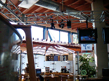
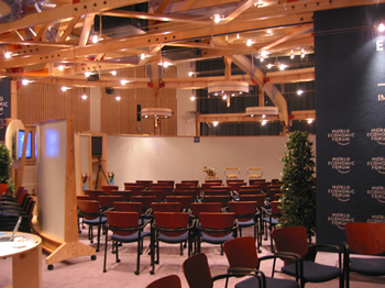
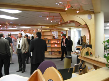
The drawing and three pictures, to the left, are examples of MG Taylor Armatures. The drawing is my 1990 sketch of an office layout. It is the first to show armature, cube-office and POD elements in an office layout - all standard AI products today and all elements that will be employed in the UniCredit environment. The first picture is an armature in a small space built for Master’s Academy. The bottom picture is for medium sized environment. It is an RDS [link: rds concept] Armature and system used by the WEF at Davos in 2005. The bottom picture is in average NavCenter space (about 10,000 square feet - 929 square meters) however one with a low ceiling (9 feet - 2.74 meters) built for Vanderbilt University. Click on the pictures and drawing to go to information about the projects.
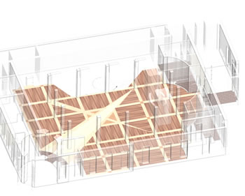
The Armature for the UniManagement Development NavCenter will take the Armature concept significantly further than any prior application. There are several aspects of this. The UniManagement Armature is considerably larger than any that has been built, the closest being the Capital Holding project built, in 1992, and the 2005 WEF RDS which was in a small space but was a large, movable and self supporting (a first) Armature. The UniManagement Armature will not only house technology and lighting, as is usual, it will also be a display surface, itself, and therefore medium for a wide variety of media. In all prior applications, the Armature served a remedial role as they were installed in spaces with no architectural value. The Armature had to find what structure was there, but not expressed and bring it out. At UniManagement, the building has significant architectural quality with many dimensions of horizontal and vertical space. It actually is an armature element, although interior, the way Greene proposes. The UniManagement NavCenter Armature is augmenting an already good space - although one which would lose human scale without it. The Armature system is made up of the existing building, the floor surface patterns - which echoes the existing column spacing - and the Armature truss which derives it shape from the horizontal column spacing and the harmonics of the various ceiling heights in the existing building (see the diagram below). Symbolically, it is the past transforming into the future and what else is education and design? There is one other unique quality in the circumstance of creating this Armature. With exception of the steel work in the Capital Holding project, all Armatures have been built by the AI shop. This one will be a collaboration between the Taylor organization and Permasteelisa - the first world class design, engineering, manufacturing and building organization we have worked with. Their sophistication allows a degree of art otherwise not possible. This is important and not just a matter of architectural play. The purpose of the UniManagement Development Center requires it [link: program statement]. The resulting design is a fully three dimensional piece which both enhances the existing space while it plays counterpoint to it. It is a sculptural piece of art in its own right. It is a device for setting the sense of space and focus of the activities within it - on demand in real time.
The Armature creates the space and Center of the environment. It caries wiring, lighting, adjustable screens, multimedia display and recording equipment. It is an Icon which facilitates strong memory [link: memory]. It expresses the theme of the UniManagement Development mission. It incorporates historical references on the scale of Italy, Europe and the world. It is based on universal geometry. It creates (adjustable) vertical scale by visually - employing screens and lighting levels - being able to raise or lower the perception of height and enclosure on demand, thus, the sense of place, prospect and refuge. As will be discussed elsewhere, this is orchestrated in consort with the learning and work processes taking place so that there is congruence between the cognitive and perceptual experiences of those employing the facility.
The Armature also effects the acoustics of a space. It breaks up the sound waves much as a stealth airplane does to radar. It is possible to use this capabiliity, along with active electronic systems, to “tune” a space. The acoustic nature of a space is often overlooked except to “dampen” down loud noises. This often creates acoustically dead places that are as bad as too noisy a space. Sound is one of humanities’ strongest sense and how a building “sounds” and “feels,” in the direct tactile sense (the texture of materials and surfaces), is as important - if not more so - as how it “looks.” This is, unfortunately, often overlooked in modern architecture which is one reason why people often feel that it is cold and cerebral and lacking human sensibility. I will discuss texture and color elsewhere.
Architecture is sensory art and it is also a conceptual art - two aspects often presented as two opposing camps. If you want people to learn, be aware what they are leaning from the building you put them in. If you want them to recreate their future put them in one example of a future workplace that works.
|
|
 |
 |
 |
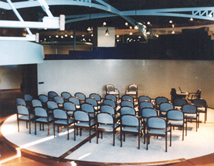
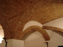
The four examples at the right are all illustrate the use of armature in architecture. The first is the National Gallery in Washington DC [link: page 534 matt taylor notebook], followed by the capital Holding NavCenter, a room at the Lesmo residency Villa and the Palo Also knOwhere Store built in 1997. In the historical examples, the armature is passive; that is, it serves only what are considered to be traditional architectural functions. In the case of MG Taylor work, the Armature takes on a much broader role and becomes an active “participant” and facilitator of the activities taking place within the environment. Taylor Architecture’s view is that architecture has to address the design, building and using of a space. All of these three aspects are key to the creation and practice of architecture [link: mg taylor philosophy and practice of architecture - 1978]. This is a practice of architecture which reinforces its ability to be an agent of transformation [link: usonian - mrs pew story].
It is important to realize that armature was a consequence of how traditional architecture was built because structural requirements dominated and formal qualities like axis, line, plane, mass, fenestration, proportion, scale and use of materials, were understood having evolved over a period of several thousand years. Each successive civilization created their unique style, expression and way of building but the fundamentals remained consistent from prehistoric times until the late 19th Century. While individual buildings could be built remarkably fast, the overall pace of development was slow compared to today. Materials and structure constrained design. Now, structure and the visual elements of a building are generally divorced. Materials have become veneers hanging on hidden structural elements of astonishing capability but no tangible meaning. The plan is often lost in a glut of misplaced exuberance to try anything, our technology allows us, without understanding the consequences.
Greene introduced the Armature concept in order to repair the damage that modern development is causing to the fabric of the city. This is understood better in Europe which tends to preserve and re-use and add rather than in the United States where whole “cities” have been thrown up, over the desecrated remains of old cites or a violated Nature, with nothing about them resembling a city at all. Europe, to a remarkable degree, has maintained its cityscapes while evolving them. We brought the Armature indoors because the majority of modern buildings have no interior structure They are just a bland, emply space divided by cubicles interrupted by a stray column here and there. Also, even buildings that do has some sense of structure are generally based on a concept of living and work processes which are too simple and constrained to serve modern requirements. The modern workplace, for example, requires great flexibility as it must support many work modalities on individual, team and large group scales. As a practical issue, this requires extensively flexible work spaces. The greater the flexibility of the components, which make up the system, the greater the need for an spatial order to bring coherence and context to environment. In the majority of cases, flexibility (which is usually just putting wheels on what existed before) has added greatly to the chaos and sterility of the interior environment.
So, the Armature has three main functions: to become a structure which is not there (or to augment one which is); to become an interface and consistent context for the kinds of functions, modalities, spaces, technologies and tools demanded by modern living and work; to be a living work of art that appropriately captures and expresses the values and aspirations of the people who employ it. In doing so, the Armature becomes life-like - a forest in which the human spirit and desire-to-accomplish can prosper. |
|
|
|
|
|
section and details of the Armature goes here |
|
“I shall argue that the right kind of physical environment, when it has living structure, nourishes freedom of the spirit in human beings. In the wrong kind, lacking living structure, freedom of the spirit can be destroyed or weakened. If I am right, this will suggest that the character of the physical world has impact on possibly the most precious attribute of human existence. It is precisely life - the living structure of the environment - which has this effect...
“A healthy human being is able, essentially, to solve problems, to develop, to move toward objects of desire, to contribute to the well-being of others in society, to create value in the world, and to love, to be exhilarated, to enjoy. The capacity to do these many things, to do them well, and to do them freely, is natural. It arises by itself. It cannot be created artificially in a person, but it needs to be released, given room. It does need to be supported. It depends, simply, on the degree to which a person is able to concentrate on those things, not on others. And this steady-mindedness, even in joy, is damaged by the extent to which other unresolved or irresolvable conflicts take up mental and physical space in a person’s daily life.”
The Nature of Order
An essay on the Art of Building
and The Nature of the Universe
Book One pp. 372-373
Chiristopher Alexander
2002
|
|
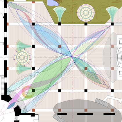 |
| The Armature Truss is composed of a square cross section turned 45 degrees from the horizontal reinforced with periodic bulkheads which are on line to the various columns. Two of these run from the Rotunda threshold to a point along Axis line “C” starting at 7 feet at the center line and rising to 21 feet at the column termination. Each of these cross sections are “wrapped” with curved tubing with glazing in various locations which terminates in the are where the three Axis lines cross. This tubing provides structural reinforcement as well a mounting for lights and multimedia equipment. Between these two cross section along Axis “C,” is another tubing pattern - on a larger scale - which ties both cross sections together. This pattern runs to the far column on the diagonal line. This is crossed by another Armature Truss on the other diagonal whose cross section runs from the left hand column rising to terminate on the right. Its tubing, on the scale of the center section along Axis “C,” runs from the left hand corner to the column. The basic patterns are repeated with variation on the vertical and horizontal axis lines as they slope upward toward the elevators and raised platforms. |
|
 |
| The geometry of the tubing is derived from harmonics created by the dominate horizontal planes of the room from floor to dome. This pattern is repeated at various iterations and recursion scales. |
|
As a composite geometry, the Armature has both “mass” and “lightness.” The geometry allows ample opportunity for wiring and the placement of required technology. It creates a series of adjustable transparent and translucent “screens” which establish horizontal sheering layers between human scale and the existing dome. The geometry show in the drawing above indicates most of the many opportunities inherent in it. As engineering is completed, the “unnecessary” “lines” will be eliminated and the pattern “simplified” to just those elements carrying out a direct function. The is a dialog between the full potential of a pattern and the strict requirements of a specific solution. What emerges is the system of both. This is but one example. The building, then, becomes a build example of these processes - an instruction manual written in stone, marble, wood, steel and glass. This is in the manner of the old Cathedrals and one reason why I say a NavCenter is “a cathedral of work.”
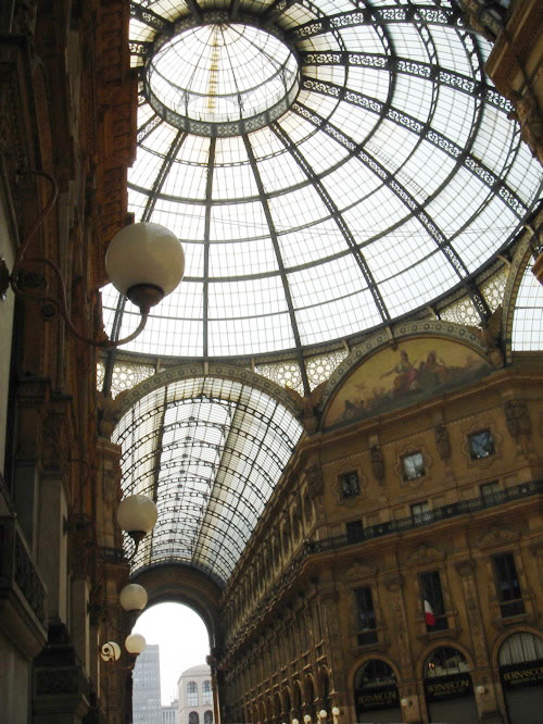
I end this discourse on Armature with some reflections about the historical context in which this project is being done. Armature exists at many scales - levels of recursion - and all add up to make the physical context in which life is lived and work is done. The Galleria [link: galleria - great buildings] in Milan is one such example - it is a significant part, along with a cathedral and an opera house, which makes up the center of Milan as a place and an institution. It is not stretching things at all to note that UniManagement Development has this role in bridging the past and future history of UniCredit. The NavCenter is required to support this role and to contribute to the critical reinvention of the city in which it is placed: Turin. Human life, culture and enterprise, historical time, a city and its rebirth, the transformation of a corporation and an industry - all - are threads in a single fabric. They have to be addressed as such as no single aspect can be successfully built or repaired in isolation.
The UniManagement Armature reflects the past while making a future sense more tangible. It does so by its geometry (referencing and reflecting the existing structure), by being a multimedia platform (ripe with colors, textures, images, Icons sounds) and by directly expressing iteration, recursion, change and complexity as a sculptural theme. The Program Statement further develops these ideas as does the Specifications section of this web site.
|
|
|
 |
THE FLOOR EXPRIENCE is...
The element which “grounds” the activities in the space.
The floor plane, once a major focus of architecture has become a neglected utility. It has lost materiality, pattern and texture in modern times. It has also lost durability. All this in the name of “economics.” Yet, the floor plane - along with the also often neglected ceiling - is the single greatest conveyor of sensibility, continuity and meaning in the built environment.
The floor plane is also one of the strongest architectural means for creating scale in a work.
There are any ways to make a floor and this is frequently overlooked. The tenancy, today, is to establish a quality range (the major cost factor) and then select a material from it, that has the characteristics desired, and then cover vast areas with this one material in a way that does not reference or relate to the other features of the building. The “great plane” of the floor becomes a conceptual desert. Emptiness does not create a sense of space.
The floor, in the NavCenter, has to do several things. On the utility level it has to allow walking, rolling large objects, feed wiring to technical workstations, sustain heavy treatment, clean easily and be reparable in small sections. In terms of message it has to orient people to the space and assist them in their navigation throughout it. It also has to project the subliminal message that they are standing on firm ground as they take the risks associated with genuine learning, design and collaboration. A buildings floor is the “ground” that you stand on. A balcony or raised level, depending on its function, can be more “lively” and often should be. In the case of this NavCenter and the function of these raised places, this would be not only acceptable but a positive architectural quality. On the esthetic level is has to reinforce the theme of the work, tie visual elements together, provide materials which stimulate and please the senses and contribute to the “music” of the building - rhythm, shape, geometry - in a way that provokes the intellect.
Default standards dominate design decisions over time and reduce the variety of solutions. For example, everyone “knows” that an interior floor must be level, flat and smooth. Well, every floor with these requirements should be very level, very flat, and very smooth - as much as materials and workmanship can accomplish. It does not follow, however, that every part of every interior floor has these requirements [link: ecosphere floor]. The “floor” is not only a plane to walk on and place things, it can be a place to sit, to look at (as a landscape), to lie down on, and use as a display surface. It can be a surface to look through and to look down from and to look down on.
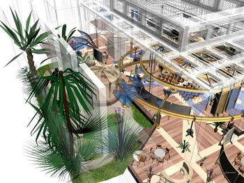
There are, essentially, three kinds of space uses: utility space, navigation space and enclosure space which is defined by a mix of prospect and refuge. These spaces are defined by the floor, walls ceilings and features outside the building which can be viewed through glass. In the case of a Taylor NavCenter, the space is also augmented and defined by architectural scale WorkFurniture and Armatures. Also, in the case of the NavCenter, the space can be reshaped by how the large scale movable elements within it are manipulated.
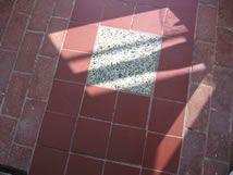
The patterns employed in the layout of the UniCredit NavCenter floor plane are selected to enhance all of the various qualities of FLOOR and to augment users sense of place, prospect, refuge and ability to navigate the environment. It is designed to bring focus to the unique quality and uses of each section of the environment. The patterns derive from, references and relate to those inherent in the overall structure both as it has existed in its original form and how it will be modified. The floor performs a major integrating function. The five examples of “floor” on the left illustrate important principles, techniques and applications. The first is a painted wood floor from the personal studio and home of architect Charles Moore. This is an old house that underwent much remodeling and additions over time. The painted wood floor can be an economical way to introduce pattern at a variety and scale that might be economically prohibitive otherwise. It also lends itself to change over time and brings with it a more intimate sense of floor while removing inhibitions often provoked by more formal and expensive materials. This floor of Charles Moore connotes a sense of play, natural creativity, and the message “I cannot be hurt - get involved; have at it.” The next is from Lesmo and again points out to what is being left behind and to a time when people built to last for centuries. We are in the land of mosaic tile. What kind of message does this floor send and how is this relevant - thus practical - today? The third floor example is from the Palo Alto knOwhere Store built by MG Taylor in 1997. The carpet is two colors and textures which follow the column lines of the space which converge in the center rotunda under an opening skylight. The MG Taylor logo was cut into the carpet pattern. A high quality carpet can withstand a great deal of heavy use over many years. In a space like a NavCenter, it has to be cleaned often. Patterns can be created with relative economy and the carpet aids the acoustics of a lively space. The fact that carpets do have to be replace periodically presents the ability to refresh the look of a place from time to time. The last two are “outdoor” floors. The fountain is from Moore’s home and the other form an entry in a Northern california artist’s studio. They remind us that simple materials can work well - even better - where hard finishes are not required. The Green Area should have this outdoor quality.
There are many attributes, common in flooring today, to avoid. Raised flooring that deflects and produces a hollow sound does not provide the “firm foundation” which is a functional requirement of a NavCenter. In that the necessary wiring feeds can be arranged by other means, the expense and quality loss of a raised floor is not necessary. Manufactured and pre finished flooring has to be carefully selected if used. Often, the finishes will not hold up to heavy use and they are difficult to subsequently restore. Another issue with this kind of flooring is often the patterns are arbitrary or prosaic at best. The pattern of the floor creates zones, aids navigation, ties the space and experience of it together by referencing other geometric elements, and, it brings the volume of the room and the horizontal expanse of the floor plane down to human scale. A floor should speak with strength and the special character of whatever materials are employed should be drawn out and brought to life. Many “manufactured” wood floors seek to tame the material and domesticate it. This contributes to a uniform, slick look with a lack substance. If this is the quality sought it is better to select a material with that intrinsic quality rather than try and turn a race horse into a nag. NavCenter flooring has to be durable yet all materials do wear. This is where traditional materials such a wood, marble and tile to best. A deck of an old boat [link: camelot], used for decades, is actually better than a new one. Metal - other than bronze - is actually very poor in this regard. The best it ever looks is the day it goes in and very scratch and mark is a “flaw” that cannot be repaired rather than being a cherished memory of its use.
The health of materials is also an other issue to consider. Many materials out gas for a considerable period of time. With others the cleaning process requires harsh chemicals. Carpets tend to collect materials that can be unhealthy. Many materials are from non-renewable sources or require manufacturing processes that are highly polluting or excessive in their energy use. Of course, all of these costs have to be weighed against how long the material lasts. As in everything, the true costs - be they financial or social - have to be considered in context of their full life-cycle use.
For all these reasons, I have chosen wood as the main floor covering and cork, mosaic tile as supplements with a small piece of Natural lambs wool carpet on the second level sitting area. The production areas to have a rubber resilient floor and, of course, the Green Area to be landscaped as an outdoor area would be. |
|
 |
 |
 |
 |
click on drawing for double-sized view |
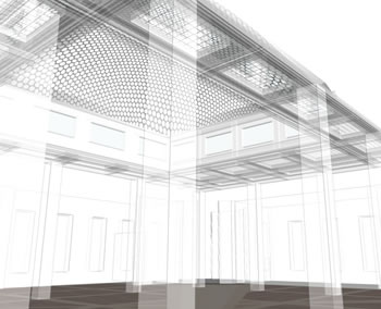
| The entire floor surface reads like a large woven fabric. It is primarily made up of the various woods used in the WorkFurniture and trim except for finish #5 which is rose wood which is a degree darker. The core lines of the Armature Truss are mimicked reinforcing the diagonal entry and view. The POD floor surfaces are cork and the entry and bathroom areas are mosaic tile with a pattern and color selected to bridge between the existing marble and the new materials. The concrete at the border and slab “containing” the Green Area is colored (poured in place) with a smooth trowel finish and waxed. The color range will migrate from light woods to dark in graded steps. The natural finish of the materials and the pattern is intended to blend the transitions and avoid sharp contrasts. Where different materials meet or boarder each other the edges are “eased.” While actually not, the overall effect is monochromatic and the “over-scaling” of the floor pattern mediates between the volume of the space and the human zone of occupancy and use. There is a measured gradation between the volume, the various ceiling levels, the sloping Armature, the Trees, WorkFurniture and WorkWalls all supported by the horizontal floor plane. The pattern of the floor informs the set ups of the various work areas in the Radiant Room, encourages diversity, yet maintains visual relationships necessary for coherence and continuity. |
|
| Finish 1 at the entries, ramps and rest rooms is a mosaic tile with a repeating pattern on three levels of recursion. The colors to bridge between the existing marble and the new wood, glass and steel of the new interiors. Modern interiors built in classical buildings too often force an abrupt transition between the two. This dissipates the value of both idioms. A close integration between both is possible and necessary if continuity is to be be achieved. Doing so sends a powerful cultural message. Finish 2 is cork which is for the interior of the PODs and the “squares” in the floor pattern defined by the existing columns layout. This is a more resilient surface than wood and better for an intimate space. The color can fall in the middle of the spread of the different woods used in the floor and for the WorkFurniture. Finish 3 is birch (cut from plywood) with T&G edges and chamfered edges. The radius is from the center line of the Rotunda. This element defines the diagonal path, reinforced by the Armature above, across the radiant Room. The floor pattern is horizontal, the armature rising with the existing ceilings raising in two flat planes and one dome shape then declining again. The complex vertical space is augmented by the Armature and anchored by the floor. The linear lines of the three Armature trusses and the floor are embraced and softened by the Armature’s curved elements. |
|
| Finish 4 is laminated Maple, a few tones deeper in color than the birch, with a darker grain. The Maple scribes the Armature lines and column column grid onto the floor plane. This is a strong linear statement. It connotes focus, boldness and a sharp intention. Finish 5 makes up the main flooring material. It is 3/4 inch solid rose wood flooring. It forms an oversized “parquet” flooring pattern creating a change of scale of a familiar traditional pattern. This architectural “humor” juxtaposes the traditional with the modern, while respecting both, and contrasts the familiar with the unfamiliar - an essential element in both learning and creativity. This is a direct architectural reference to the THEME of the environment [link: unicredit navcenter theme]. Finish #6 is a 3/4 inch cherry strip on edge between each change in material - it is the “pencil line” which delineates each from the other. These wood finishes, together, constitute a close gradation of color and texture from light to dark - from open grain to close grain - from soft to hard. Together, them make a mosaic of pattern - a rich, tactile surface at once polished and warm. We now come to the contrasting finishes. Finish 7 is a sitting height curb and integral colored concrete slab that “contains” the Green Area which is, Finish 8, a “natural” garden of planting, stepping stones, bark, stone and water. The concrete color, Finish 8, is the color of terra cotta with a trowel surface finish with several applications of wax. |
|
click on drawing for large-sized view |
|
TEXTURES AND COLORS
Modern architecture is losing materiality [link:]. This is a great loss. Living becomes an abstraction. Close your eyes in a modern building and run your hands over the surfaces of a typical building - there is a depressing sameness of sensation. This is a world devoid of information. It is said that the city you want to walk in is a livable city. There is merit in this. I will extend this perception: the building you want to touch, and get close to, is a livable building. There is a QUALITY to materials. This quality connotes associations and ideas. It provokes a response in each human in both an unique and universal way. Architecture is a language that specks through line, plane, mass, axis, color, texture, icon and symbol. Color and texture are primary words in this language. They provoke a primary response. As human beings we respond to this language but often deny this when we build.
The pictures on the right illustrate materiality. The first, second, fourth and sixth are examples of vernacular architecture where I live in Northern California [link: mendocino]. Here landscape and materials are used in a basic, organic way and created by simple craft methods. The third image is of my boat, CAMELOT, which is made of teak. She is hand built yet very sophisticated in her construction techniques and the integration of technology, sailing performance and the craft of making a comfortable living environment. The fifth, is the lobby of the Hyatt Part Hotel in Milan. Here a steel and class dome housing a modern interior, in what once was a court yard, looks up at the original exterior of the building creating a reasonably successful integration of the old and the new. All these pictures express a similar quality with the caveat that the Hyatt environment could have achieved a much greater level of tactile quality than it has. There are several principles to be gathered from these examples; principles that can be applied to the making of the UniCredit NavCenter environment and must be if we are to achieve the quality necessary to the accomplishment of the mission.
Quality, as I use it here, does not mean “expensive” materials and excessive labor costs. Quality is not achieved by just spending money. It is achieved because of the intrinsic nature of the design and how it is rendered in the design process. Quality is the consequence of authenticity. This means that “design” in the abstract will not do. Design, in this context, starts with the program of the environment and bases the solution on the experience that the users of the environment will have. This experience has intellectual, emotional, psychological, spiritual, physical and sensual components and all of these have to be in harmony with each other and the function of the place.
Nature employs a rich pallet of forms, colors and textures. The human built environment tends to be impoverished by comparison. Yet no matter how lavish, Nature’s designs seem integrated and harmonious. Human designs, when not over simplistic, often become unnecessarily complicated with clashing elements. Organic architecture [link:] is the study of Nature in order to extract principles that can be applied in the process of building human habitats. It often employs “natural” materials and nature-like forms but this is not the essence of what make a work organic. I call my work AUTHENTIC [link: authentic architecture thesis] architecture because, while employing the general precepts of organic architecture, I am far more deeply concerned about the deep processes - both work and living - that take place in the built environment and challenge the default design assumptions, common to almost all architects, that define human functionality. The primary focus of my work is on experience - the experience of building and the experience of using the environment - and evolving - it once built. I believe that architecture is “authentic” to human nature when “mind-like” environments are created to directly augment human cognition and physical action.
This approach does not accept the traditional “soul-body” dichotomy and attempts to place either mind or body over the other. To me, architecture is built idea and this becomes manifested in the experiencing of life lived and life worked within an environment that is both intentional and emergent. For this reason, the modern attempt to remove materiality from buildings is experienced by me as a mistake. Architecture is becoming increasingly cerebral rendered in abstract and arbitrary forms, thin veneers that cover what the structure is really doing, and misused transparencies. While this is often stimulating, exciting and titillating - the center does not hold. Humanity has has a few hundred years to understand the great new technologies and their proper use; thousands of years to employ traditional materials. Both have value and both can work well together. And while it is good to use materials efficiently and to reduce the unnecessary and redundant labor in both design and building, the den materialization and loss of quality which is the consequence of misplace “economics” is not acceptable. People are not comfortable, grounded and productive in these environments and given the opportunity the vast majority will flee them.
It is extremely important that the UniCredit environment avoids this fate. The NavCenter is a temple of learning, design and collaboration - expressions of the human in us all and critical skills for survival and prosperity [link: a future by design - not default] in the 21st Century. The UniCredit NavCenter must create a PLACE capable of symbolizing, facilitating the processes, and holding the necessary focus and energy intrinsic to accomplishing this goal. The way to create a new future is to invite people into the best model of it that you can build and ask the to learn and then invent their’s and the corporation’s future state. The NavCenter is both an “example of one” and “an engine of creation” that facilitates the imagining and making of this future state.
|
|
|
|
|
|
 |
 |
 |
You cannot have uncommon results by common means. Nature does not allow it. Only the too socialized believe they can have excellence and their comfort. Only the dull confuse the tools of building with the act of building. The insecure want their rules. Only a coward demands control.
Life must be lived, not managed.
Blinded by fear and ambition and stale, used up rules, we battle our way through embittered days. We take all the joy out of our work. We succumb to accountancy. And we destroy our lives and our planet. Heartless, joyless, we become killers. We kill the Human Spirit, and in doing so, kill everything else.
Trees become boards, a commodity to build unwanted, unseen, neglected walls. What is a wall anyway? Nothing important. Nothing to have meaning, beauty, pride, presence. Nothing to shelter, to make space, to organize life, to inspire praise. Nothing. A waste of a tree. A waste of the life force that built. A box to trap a promising life and a dying spirit.
Why do we do this? Why do we fail ourselves? Why do we let our lives become meaningless by failing to give meaning to our work?
To make money?
You cannot make money. You make a building [or an enterprise]. In doing so you make value. Value allows money.
To build is to reveal your soul. To build is to engage, to act, to touch, to love. If you want a Cathedral you have to be a Cathedral builder. You have to stand in bright light and be counted. You cannot hide in mists of mediocrity and safety--of normalcy. You cannot accept limits, yours or anybody's, as mandated, given, immutable. A Cathedral uplifts. It inspires. It demands. It transforms. A Cathedral is a temple for the God in each of us. Its budget is the measure of our ability to give passionately, without reservation, fear or self-centeredness.
A Cathedral is not ordinary and it cannot be had by ordinary means.
I have one question to ask of you: Why? Why would you ever build anything less than a Cathedral?
Matt Taylor
1992 |
active floor plans and sections:
CAD • Canvas • pdf
|
|
 |
 |
| The images above show Armature Strategy #3 [link: options] which has been accepted by Unicredit and the basis of all work since mid-May, 2006. Part 2, of this concept walk through will also be shown with the wef 05 RDF Armature as it will be originally be installed. The principles illustrated will be the same when the UniManagement Armature, as designed and illustrated above, is installed in the future. |
|
goTo part 2 for: functional areas • platforms • Garden • process augmentation • technology requirements • lighting patterns •technology requirements |
posted:
February 24, 2006 • updated: May 24, 2006 - 15:17 Turin time
|
o t h e r d d r a w i n g s |
|
|
ver 2.5 drawing INDEX |
link coming
|
|
|
| GoTo: UniCredit NavCenter INDEX |
|
|
|
|
| GoTo: ver 2.5 Line Drawings INDEX |
|
|
|
|
|
|