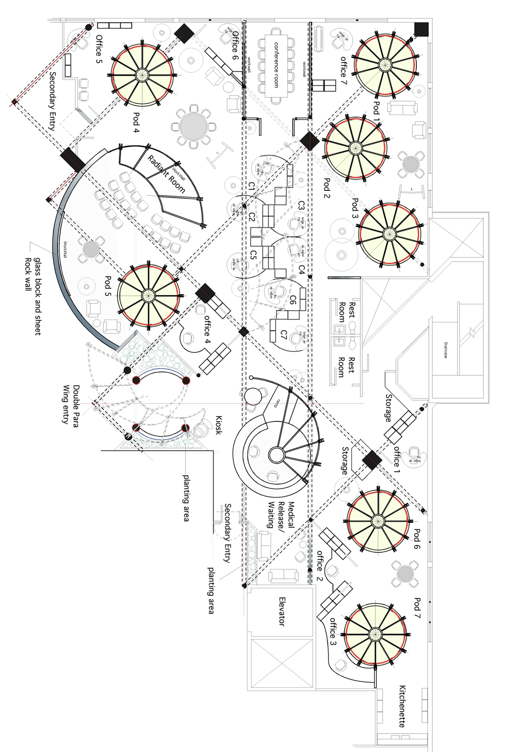
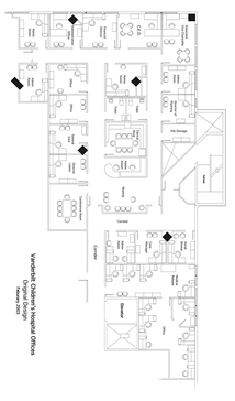
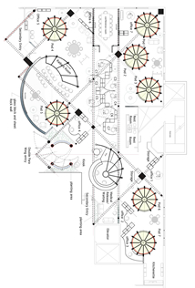
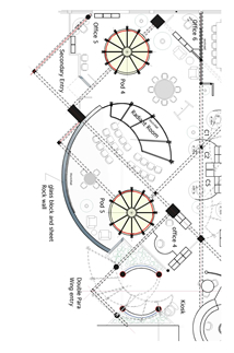
Description and Philosophy | | The VCH Executive Offices are to be built in a five thousand square foot space within the new Children’s Hospital Building now just entering the substantial completion stage. Jim Shmerling, the CEO, selected the location so that the Offices can be accessible to staff and customers. For this reason, the Office is to be located just off the Cafeteria dining area. Jim also wanted a much greater level of interactivity among his staff - among themselves, othe hospital staff and their customers - than pervious environments facilitated. These principles of accessibility, location and interaction determined many aspects of the subsequent design. | | The original proposed layout was a conventional design of offices ringed around and inside a doughnut shaped hallway. The principle defects of this approach are: |  | There is no significant ENTRY into the space. The Hallway provides no function or ambiance other than basic circulation. Exterior light cannot travel through the space. Interaction is not encouraged among the residents of the space nor between the Officeitself and other environments. | | | |  | The new plan is based on a collaborative work process both formal and spontaneous and “signals” interaction and inclusiveness and facilitates these interactions. It clusters residents in ways related to their work and provides greater support for the many work modalities intrinsic to the modern workplace. | | | | | Both in symbolic language and in practical facility, these two approaches are different paradigms of what work, the workplace and human interaction should be. These are not issues of stylistic difference. They express an entirely different grammar [link] and Pattern Language [link]. They are based on a different view of humanity and human potential. Architecture is the built expression of philosophy and it becomes the structure in which we live and work. We react to these structures in a thousand ways. The original layout is the expression of territory and division. It is composed of rigid forms that had to be forced into the footprint making awkward places and transitions. There is little opportunity for a sense of place, for spaces of different character and nuance. It is machine like with a one-size-fits-all mentality. What message [link] does this approach to the workplace send people? When asked, this is not the kind of space Jim and his staff said that they wanted and their reasons are worth reading [link to survey]. | | Two Aspects of the Design | | There are two major aspects of this design: the work to be done to the building itself (“leasehold improvements”) and the WorkFurniture system that goes into this container. The principle modification to the existing architecture is the long wall [left hand side of drawings] between the Executive Office and the Cafeteria areas. While maintaining distinction and privacy, this wall - in Plan version #5 - creates a permeable membrane on several levels: shape, visual transparency and translucency, materials and idiom. This membrane must also act as the interface [link: definition] between the larger environment of the Hospital and the executive offices. [link for a discussion of architectural membranes] | | The shape breaks the line between the two areas. It “gives and takes” between the two spaces. It establishes awareness of activities within both spaces without losing necessary difference and privacy. It is graceful. It establishes the conditions for entry [link: Pattern Language] and exit. It reveals a wall of thickness and substance. |  | Thecurved portion of the wall is made up of glass block, sheetrock, tile and operable windows (translucent and transparent). The Armature system used throughout the Offices projects into the food quart space. A trellis piece defines the main Entry. The Radiant Room is directly behind the curved wall and easily reached through the secondary Entry. | | | | | The entire wall will have to be carefully crafted to integrate with the design of the larger space in which the Executive offices fit. Some of the aspects of this are outlined elsewhere [link]. The main Entry to the Executive Offices sets back into the space, in a area of extensive landscaping - this “pulls” the visitor into the Office. The Entry can be seen from two locations: the Reception Desk and Office #4. Pod #5-Office #4 interface with each other and are located close to collaborative activities. The Radian Room WorkWall located below the Trellis swing to accommodate larger groups (up to 40) when required. All of these components function as a unit and make up capabilities most often lacking in the typical executive office suite. | [more notes will be posted by June 1] | | | The palette of this project is basically light, wood and work surfaces of various materials. Light in various forms: outside light passing through the workspaces; mechanical light from a variety of fixture types providing user controllable ambient, background, highlighting, spot lighting and task lighting functions; light filtered by trellises, screens and plants. Moving clear, translucent and opaque screens will be part of the Pod and CubeOffice systems contributing to a landscape of variegated light. A mixture of light (basic) and dark woods (trim and highlight) will be used for WorkWalls, WorkFurniture and certain wall surfaces. Work surfaces of various kinds: vertical, horizontal, fixed and moving to be used for display, computer work, writing, storage, collaborative sharing and work and the organization of work products. These surfaces will be made up of steel with porcelain finish, formica, wood and sticky covered paper/magnetic tiles. | [more notes will be posted by June 1] | |
